World Resources Institute
As the Data Visualization Designer for the World Resources Institute, I am able to combine my love for spreadsheets with my background in design. Under the WRI umbrella, I am able to work on our initiative projects such as Global Forest Watch, AFR100, Resource Watch, Land and Forest Lab, ESchoolBus4Kids, etc. creating maps, graphs, static designs, as well as layout and design consultations. I've integrated interactivity into WRI's Insights article hub through scrollytelling and various javascript libraries to enhance the user experience with niche climate content.
Position: Data Visualization Designer, World Resources Institute
Role: Designer and Front-End Developer
Javascript Based Interactives
Scrollytelling
Created in vanilla JS, scrollytelling stories are longer form stories that include photography, video, etc. where effects are triggered by scrolling the page. See the code
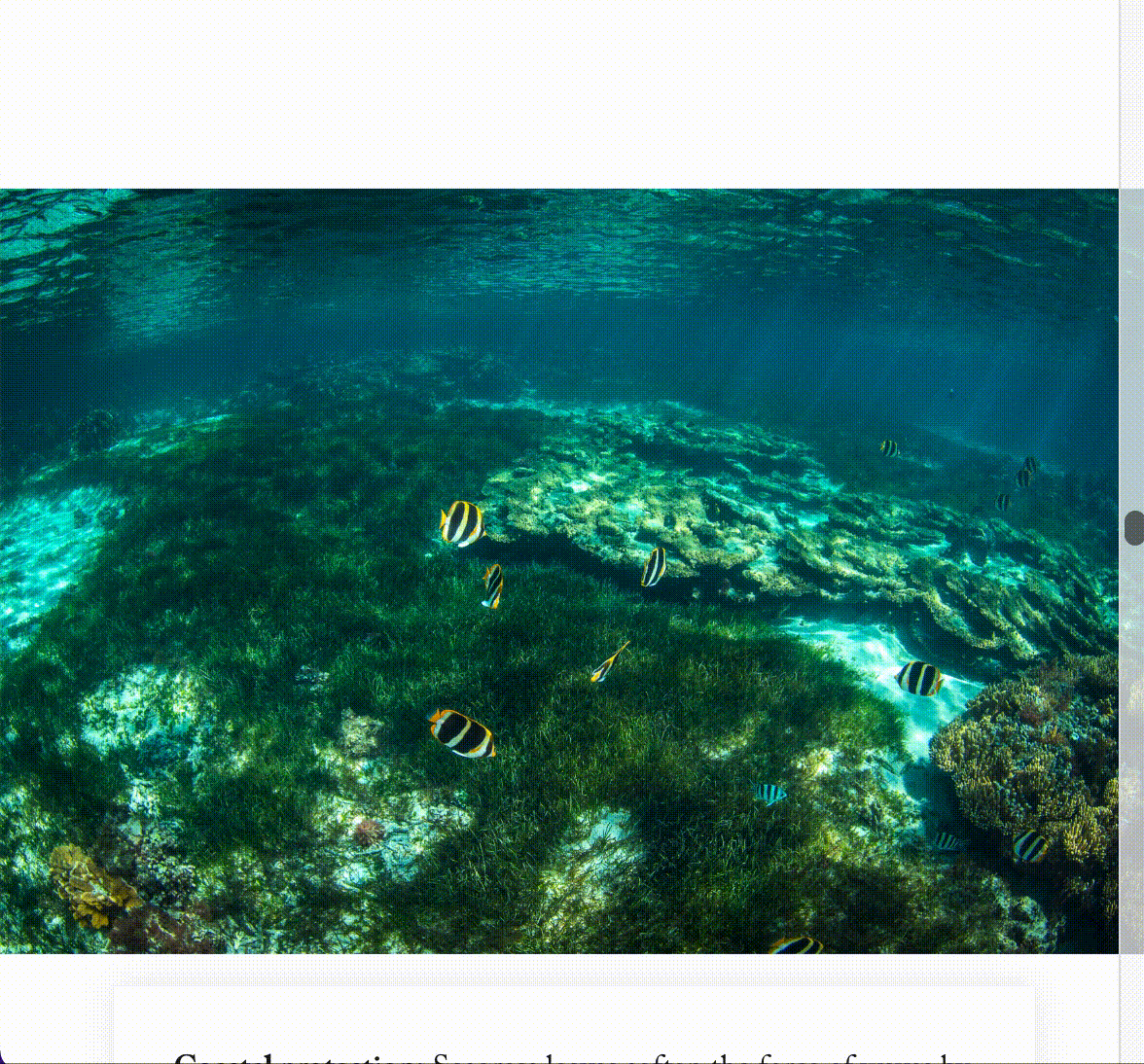
What to Know About Seagrass, the Ocean’s Overlooked Powerhouse
JS Libraries
Integrating javascript libraries such as Tippy and highcharts into Insights articles to create interaction with design. See the code
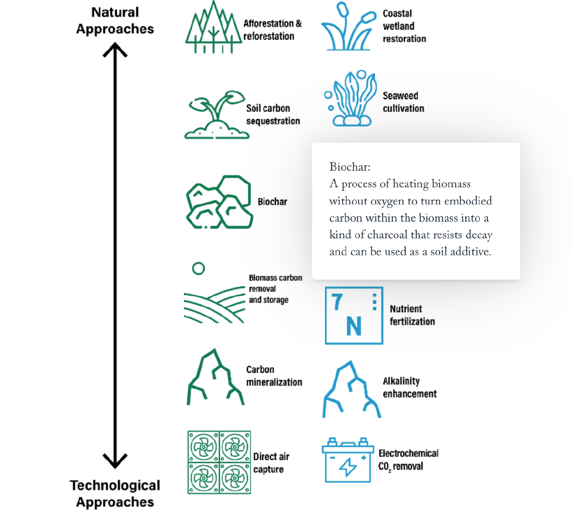
How are Countries Counting on Carbon Removal to Meet Climate Goals?
Interactive graphics made with Flourish
Click any title to see the full article
Clean Energy Jobs are a Vital Part of Rural Economies Across the Country, WRI
Working with the Climate team's research about clean energy jobs, I was able to parse through their data to find stories to show through county level maps. Hovering over any county will provide additional information about the number of clean energy jobs vs. fossil fuel jobs.
World Resources Report: Towards a More Equal City
The World Resouces Report is WRI's biennial largest report. I worked with the Cities team to create over 30 graphics, some figures and some data-focused to help tell the story of how to make our cities more equitable. Many of the graphics are interactive.
The informality of urban transport in the global South
The relationship between urbanization and national income became weaker in 2014
Graphics for the Insights Article Hub
A good portion of my job is collaborating with the Editorial team to create graphics for the Insights article hub.Some of them are created with Flourish, some are static graphics, and some have a combo of front-end development and design.
Additional Work
Click any title to see the full article
3 Ways Federal Investment in Trees and Forests Can Support Economic Growth
The State of Electric School Bus Adoption in the US
How Climate Action Can Reboot Economies in Rural America
How National Net-Zero Targets Stack Up After the COP26 Climate Summit
Ranking 41 US States Decoupling Emissions and GDP Growth
6 Graphics Explain the Climate Feedback Loop Fueling US Fires
How to Build a Circular Economy
What the New IPCC Report Means for Companies and Investors
Making Sense of Countries’ Paris Agreement Climate Pledges
A Low-Carbon Future in the US Depends on Decarbonizing Petroleum Refineries